[ad_1]
WordPress is among the most used Content Management Systems, with over 43% of the websites using it. Sadly, most of these websites are non-compliant with ADA accessibility guidelines, posing a major challenge to its visually impaired users. Therefore, as a WordPress website owner, your focus should be to make it accessible to ensure usability by all people, including those with visual impairment.
The Importance of Visual Accessibility
Visual accessibility ensures that persons with visual impairments can see and understand the information you present on your website. These include persons with low vision, poor eyesight, and different types of color blindness.
By compensating for visual challenges, web accessibility makes browsing much more productive and less frustrating for users with visual impairment. From audio descriptions, images, and font size, an accessible website will help users who rely on assistive technology to get the most from your website.
Besides practicing visual accessibility to capture potential customers, accessibility is a legal requirement. The Americans with Disabilities Act, ADA, protects against discrimination against disabled persons and requires websites to modify their resources and facilities accordingly to meet their needs. The WCAG outlines the accessibility forms that a website should take, including being perceivable, operable, robust, and understandable. WCAG 2.2 gives a detailed list of the do’s and don’ts across different categories. For instance, to protect the visually impaired, one of the WCAG rules requires a contrast ratio of 4:5:1 to aid visual accessibility.
10 Tips to Make WordPress Accessible for Vision-Impaired Users
With the above rules and regulations in mind, read on for tips to make WordPress more accessible for vision-impaired users.
1. Use an Accessible WordPress Theme

While you can choose your theme from various designs, some have features that add complexity, making it challenging for disabled persons relying on screen readers to access your content. Therefore, when selecting a theme, consider seeking a theme that specifically states it has an accessible design.
One example is the Total theme that undergoes constant updates in partnership with the University of Hawaii. Another way to find an accessible (and free) WordPress theme is to sort your options using the Accessibility Ready feature filter on WordPress.org. Themes with this filter tag have been tested against WordPress’ accessibility ready guidelines and include accessible menus, high color contrast and semantic code.
2. Use Accessible Code
An accessible code will utilize elements for their intended use, giving users who rely on assistive technology a better experience on your website. Accessible codes include the following:
Semantic HTML
Semantic HTML refers to how you use the element to define your web content and multimedia role and meaning. These include <h1> to <h6> for your headings, <p> for paragraphs, and <ol> for lists. Through semantic HTML, screen readers, search engines, and browsers can understand and navigate your website.
Language Attributes
Using clear and concise language is another aspect of web accessibility. Your language should be easy to follow and understand. Therefore, avoid jargon, idioms, slang, and complex sentences that confuse your readers. To organize your content, use headings, subheadings, paragraphs, and lists, and where you need to add an acronym or technical term, explain them first or provide a glossary.
ARIA Landmarks
Accessible Rich Internet Applications, ARIA, help make your content more accessible by providing information and context about an element to the screen readers and assistive technology. Think of it as a map of general visual and functional regions on your web pages (note – these should be used by and mostly built into your WordPress theme). By adding an ARIA landmark, you can define the application, complementary, banner, form, navigation, main, search, and contentinfo regions of your website. Adding ARIA landmarks, therefore, builds a set of “skip to” links, enabling users to jump to any of the above sections and know their functions.
Image Alt text
Images are a key part of web content but may be inaccessible to persons with visual disabilities. To make your images in WordPress accessible remember to use text descriptions as assistive technologies can read them. Using image alt text requires providing descriptive text of the image in the alt feature. Alternatively, you can use a plugin like Auto Image Attributes to speed up the process with automatic text generation.
Heading Tags
Headings are an important element of WordPress accessibility as they create hierarchy and structure, enabling users to navigate the content easily. Your main page title should use <h1>, and then within your content you can use <h2>, <h3>, <h4> etc to define content in order of importance. Your headings should also be consistent throughout your website for WordPress accessibility.
Contact Forms
Online forms are available in all sizes and shapes, from simple contact forms to complex college applications. These forms are your last conversion paths and have to be functional for your user. A user with visual impairment will rely on assistive technology, and inappropriate labeling of your form will create a barrier.
Therefore, when designing your site be sure to use accessible WordPress forms, enable keyboard navigation, label the text fields with a descriptive title, and add error messages that accurately explain issues for people relying on screen readers to complete them easily. Making your contact form accessible is as easy as selecting an accessible ready form plugin like Gravity Forms. Your form instructions should be short and clear, and the form should be fully keyboard-operable.
Skip Links
Your WordPress website features redundant navigation systems across its pages. These navigations include links at the top, down, or left side of the page and can be burdensome for screen reader users as there is no efficient way to skip past them. With a skip link, you can facilitate efficiency among your visually impaired users, allowing them to skip past these links and read the pages’ main content.
3. Make WordPress Navigation Accessible
Another important element of WordPress accessibility is ensuring accessible navigation for users with vision difficulties. Your website should be navigable using the arrow keys and tab or alternative hardware such as the single-switch input and mouth stick.
4. Choose Accessible Colors

Over 300 million people worldwide have color blindness in the form of two-color vision, deficient color vision, or total color blindness. To ensure your WordPress design is accessible, with or without colors, be conscious of the contrast and color ratios.
Color contrast in digital accessibility is how dark or bright the colors appear when placed against each other. WCAG recommends a 4:5:1 contrast ratio for the body text. A poor color contrast will affect your site’s readability among users with color blindness and poor vision.
The best way to establish if your colors are working well is by inserting them into a contrast testing tool. This is a feature available in your web browser developer tools – simply inspect your page and hover on an element to view the contrast ratio (as seen in the image above). As you test more combinations, you will become better at selecting what works best for your audience.
5. Look for Accessible Fonts
Visually impaired persons need larger text to perceive letters. By providing an alternative style sheet that allows enlargement of the fonts without affecting your page layout, it will be easier for such persons to read your content. In addition to font size, consider accessible font styles with high readability.
These include familiar options (often called “system fonts” because they are readily available on majority of devices) like Arial, Helvetica or Times New Roman, in addition to specialty fonts like OpenDyslexic. Besides making your content accessible, large fronts and Call to Action buttons will facilitate good conversions.
6. Add Captions for Multimedia Content
Audio and video are useful multimedia content to engage your audience and deliver your message. However, not everyone can see or hear your videos and audio, hence the need to provide captions describing the spoken words, actions, and sounds. Captions appear on the screen as the video or audio plays and should be clear, accurate, and complete for accessibility to disabled web visitors.

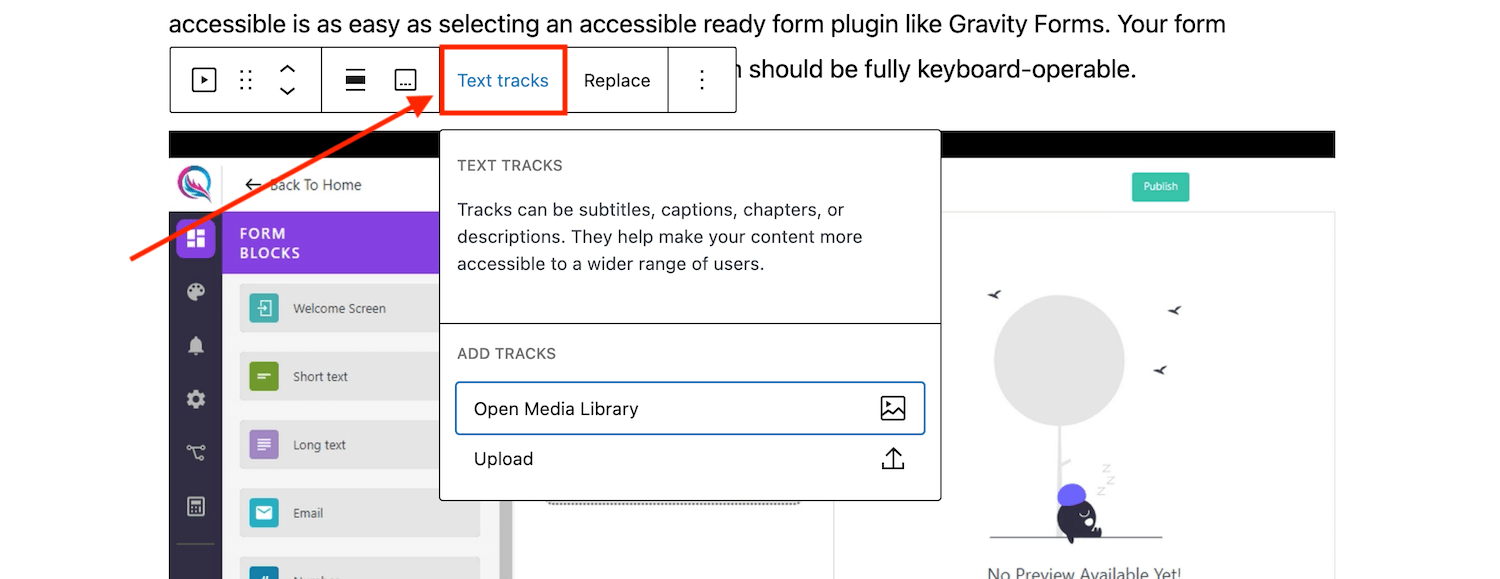
Depending on how you host your media the method for adding captions will vary. For example, if you upload and host the content on your WordPress site you can upload a text track when adding a video or audio block to your page. Alternatively, if you are simply embedding a Youtube hosted video on your page then you should add subtitles through Youtube (note – they have an auto-translate feature that makes this process very easy).
7. Make Your Content Accessible
For your content to be accessible, your readers should be able to read and understand. You can achieve content accessibility in the following ways:
Content-Length
Content length promoting comfortable reading is accessible to all users. Therefore, avoid too long or too short lines and stick to an acceptable range of 45-75 characters per line for your readers to be comfortable.
Anchor Text
Screen readers can read descriptive URLs, giving context to visually impaired users. When describing the link, use meaningful descriptions to make it easier to navigate to the right content. Therefore, avoid anchor texts like Click Here or Read More anywhere in your text, as these can be challenging for the reader to understand, especially when out of context.
Transcripts
Transcripts are a text version of your audio or video that you can read or download separately (as opposed to captions mentioned above, which are displayed in real time along with multimedia). For accessibility reasons, ensure accuracy, completeness, and clarity of your transcripts.
8. Provide Audio Descriptions for Videos
Videos are useful for individuals who can see. However, if visually challenged, you will miss a lot of content, hence the need for audio descriptions.
Audio descriptions are separate audio tracks accompanying a video, describing the visual elements in the video for persons with visual impairment. These include a description of the environment, clothing, gestures, and actions. Audio descriptions are useful when there is a gap in speech, and through them, a blind person will understand most of the video content on your WordPress website. To add an audio description you can add a secondary audio block or utilize a plugin to add an audio alternative like Scribit.
9. Don’t Use Auto-Playing Videos
Auto-playing videos frustrate people relying on screen readers and could cause confusion. When playback starts automatically, the audio from the video and screen reader will play simultaneously, making it difficult for your website user to navigate through the website to stop the video. With WordPress videos won’t be set to autoplay (and on most mobile devices autoplay is disabled by default anyway) which will allow your website visitors to start and stop the videos manually, enabling easy website use.
10. Test Your Website for Accessibility

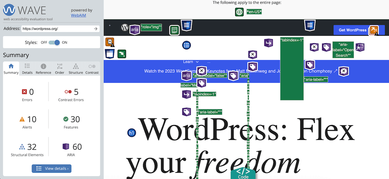
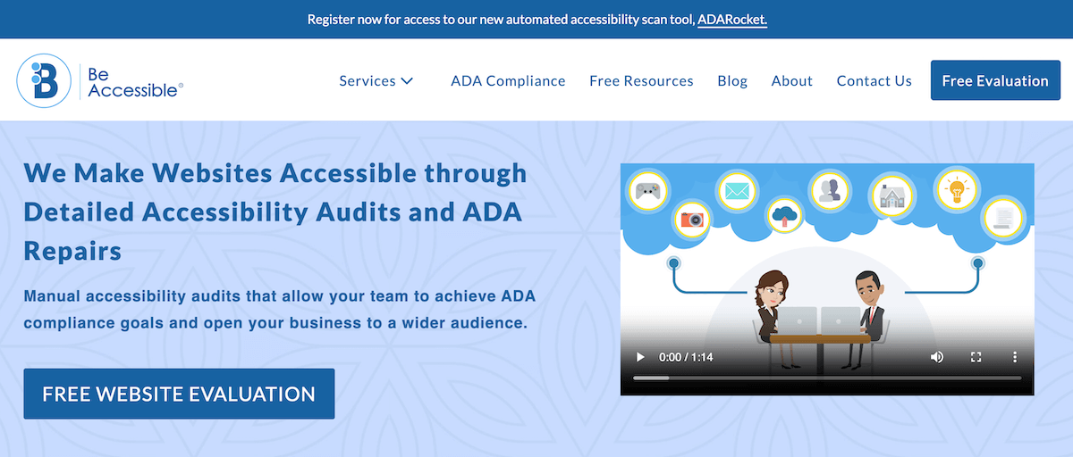
Finally, test and evaluate your website accessibility to ensure accessibility to everyone. You can utilize web accessibility tools and resources to identify errors and issues in your WordPress website. For example, you can get a free evaluation by BeAccessible or use a free plugin like WP Accessibility Tools that has an A11Y auditing feature built in.
Alternatively, do manual testing such as zooming in or out, using the keyboard only, changing the font sizes and color, and using different devices. You can also ask for feedback from real users, especially those with visual impairment, to identify areas of improvement.
Does your website provide inclusive experiences? In the above post, we discussed the strategies for an accessible website, including alt text, video transcription, and accessible themes. Following the above guidelines will support a more inclusive web experience, ensuring accessibility to as many people as possible.
[ad_2]
Source link
