[ad_1]
Currently, there are more than 600 million blogs on the internet, and with every new day, 6 million blog posts are published. That’s a lot of blogs floating around on the web, and they’re all trying to get the attention of their respective audiences.
With so much content available, no one can fault you for wondering how you can attract your audience and keep them hooked. One of the best and most effective ways to stand out in the internet’s white noise is by offering your visitors a quality experience.
A well-planned blog goes a long way to making people want to come back for more. At the core of a good blog post is its layout: how it looks and feels determines whether or not your readers will enjoy what you’re giving them.
So, in this post, we’ll discuss what you should avoid when planning your blog post layout and how to make sure your layout is good enough to entertain and please your visitors.
Why Your Blog Post Layout Matters
When you start a blog, you don’t necessarily think about how you will approach the layout of each piece you publish. And who can blame you for that? It’s exciting to create something new, and all the technicalities are an afterthought at first.
But choosing a layout of your blog posts is very important because people will start judging your blog post from the first second they see it. We’re very visual and can’t help but judge what we see.
If your blog post’s layout isn’t optimized, it will not sit well with your visitors, and they won’t spend a lot of time on your blog. Even if you have awesome content, the layout of your blogs can lead to low bounce rates and a minimal number of returning visitors.
You don’t want that, so let’s quickly look at some of the elements you need to keep in mind and avoid at all costs when planning your blog posts.
Blog Post Layout Red Flags
The following red flags are just the main ones you should be concerned about, but there could be others that are unique to your blog. Don’t be afraid to look at your blogs with a critical eye so you can pick up on anything that isn’t what it should be.
No Headings or Subheadings
A lack of headings will make it far more difficult for visitors to consume your content.
Headings and subheadings are great for breaking up content into easier-to-enjoy bits without getting frustrated with walls of text. They also make it easier for your readers to skim through the content and find what they need.
No Videos or Multimedia
People are visual creatures, and they want to see lots of pleasing images and videos. Adding images and videos gives more overall value to your content, and you can even use interesting stock videos if they’re well-made.
Images keep your readers engaged in the content you’ve worked so hard to create. Videos are also a great way to entertain and explain complex or challenging content with ease.
No Checklists, Quotes, or Bullet Points
No one likes to read through long paragraphs that aren’t separated by something like bullet points. Checklists and quotes give your content higher value and more authenticity as well.
Your content will stand out more and be easier to consume when you use bullet points and similar ways of breaking up content.
Long, Inaccessible Paragraphs
Short paragraphs may be the bane of English teachers everywhere, but they’re like honey to blog readers.
Don’t be afraid of very short paragraphs that consist of just one or two sentences; they keep things interesting. Try to never exceed two or three lines in one paragraph, or your readers might start to get annoyed.
Tips to Improve Your WordPress Blog Post Layout
Now that we’ve got the red flags behind us, it’s time to look at the positives. How can you ensure that you plan your blog post layouts to keep your readers happy?
Let’s find out!
1. Add Readable Permalinks
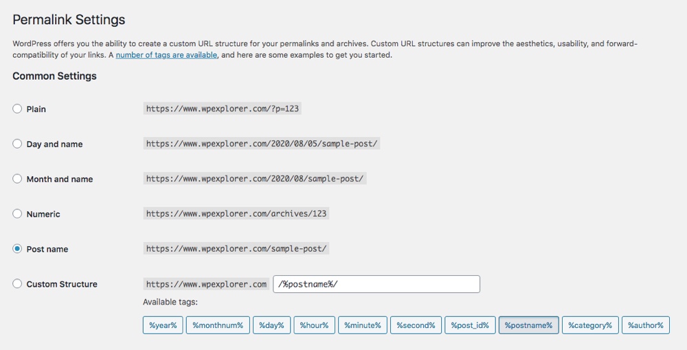
Permalinks — the permanent links embedded into a blog page — should be easy to read on any browser. When they’re not, your content loses its SEO-friendly value and doesn’t offer any value to your readers.
Permalinks play an important role in getting your content in front of more eyes. You can share them on social media to attract readers to specific blogs. Browsers like Google also use them to index content.
If you’re using WordPress, your permalinks won’t be optimized for your benefit. Fortunately, though, you can set the permalink structure to show a better URL.

The default permalink is less cool than the post name one, wouldn’t you agree?
You’ll have to do this for every blog post. It might seem tedious and annoying, but having optimized permalinks will help your blog greatly in the long run, especially if you’re hoping to attract new visitors.
2. Make Images Easy to View With a Gallery Plugin
If you plan to have many images featured in your blog posts, you have to think about how they will be displayed. WordPress will arrange your images in a column by default.
This may not be the best setting for your content, and it can mess up how long your pages are and how easy they are to use. So, use a gallery plugin to give yourself more options.
3. Add a Featured Image as a Design Feature
We’re assuming you want your content to look appealing to your audience even before they land on your blog. Having a good featured image will serve this purpose well. Many WordPress themes will use your featured image as the thumbnail of your post and display it on social media.
You must have a featured image for every blog post you publish; there is no negotiation here. With that said, your featured image must be of the highest possible quality and relevant to your post.
As much as possible, make your images as small as you can without sacrificing their quality so they’ll look nice no matter where your audience sees them. Also, avoid using common stock images because they don’t always create the best impression. You can, however, use high-quality stock images that make your content ‘pop.’
Additionally, plan which images you want to use in each blog post carefully. Using the same images repeatedly will make all your blog posts look the same. The secret to balance on your blog is good project planning.
4. Try a Sticky Floating Menu
Your navigation menu is another highly important element to keep in mind when planning your blog layout. While it’s completely optional, you should see it as mandatory if you want to make your blog posts stand out for high quality with real value to your readers.
A sticky navigation menu (also called a ‘sticky header’) means your website menu stays at the top of the screen when your readers scroll down your page. It’s great for usability and will ensure that navigating your blog is effortless.

An example of Total’s sticky header.
Note that different WordPress themes have different header designs, so check your theme settings for a sticky header option before installing any extra plugins (for example, in the Total theme this option is in the Customizer under the Header section). Depending on your needs, it may be best to play around with themes until you get the most suitable one for a sticky floating menu that isn’t too intrusive. You certainly don’t want the top half of the screen obscured by the menu, as it will annoy your readers.
5. Use Gravatar for Author Profiles
Gravatar — short for Globally Recognized Avatar — is a nice feature that gives avatars to your commenters and authors. Although there is nothing wrong with the gray Gravatar set by default, having personalized Gravatars adds a bit of personality to your content.
It is highly recommended that you have several authors creating content for your blog to add more value to it. When you have these authors contributing, their Gravatars will also pop up, giving more value to the content.
Putting faces to names gives your readers a sense of ‘knowing’ who wrote the content they’re consuming. This goes a long way towards creating trust and making your blog posts stand out.
Fortunately, it isn’t overly complicated to set up Gravatars with WordPress, and you can take care of it from the settings menu in a few minutes. Simply log in, go to settings, and press ‘Discussion.’ In the ‘Avatar’ section, you’ll see the ‘Gravatar’ option. Either select your profile or follow the prompts to create one.
6. Leverage Blog Post Categories in WordPress
If you’ve been blogging on WordPress for a while, you’ll notice that having post categories is essential on this blogging platform. And there’s a reason for this: they give your content the ability to be organized and easy to access by your readers.
Your blog must have a simple but logical hierarchy for all your pages and posts. This hierarchy improves the overall usability of your blog, which plays a big role in how user-friendly your content is.

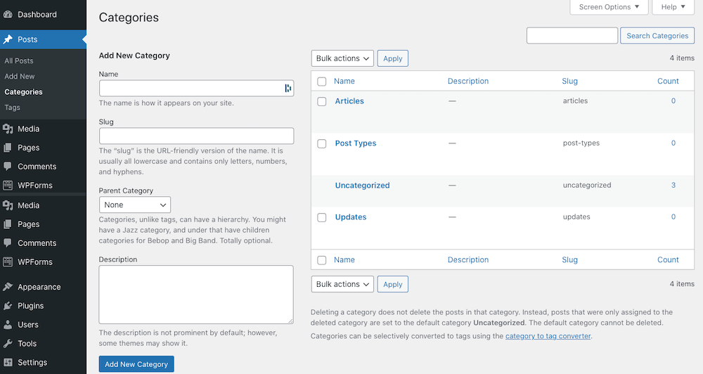
Setting up categories is fairly straightforward on WordPress.
Creating categories for your blog posts isn’t difficult, and you can do so from your WordPress menu quite easily. The categories you choose to have all depend on your content. It can vary from something like ‘Top Ten Lists’ to ‘what is an infographic?’ and will be unique to your blog.
7. Use a Minimalistic Theme
We won’t deny that having fancy themes with beautiful elements is very tempting, but it can lower the quality of your blog. Don’t forget: blogs are there to be read. When the focus is completely taken away from the written content, your blogs are no longer what you set them up to be.
You don’t have to remove all features and have a barren wasteland of words broken up by the occasional oasis in the form of an image. But don’t lose sight of the point of your blog. Stick to a minimalistic theme that complements your content, and don’t underestimate the value of white space.
Use colors that work well together, and make sure your font is easy to read and pleasing to the eye. You’ll probably have to play around with different themes until you find the right one. The best thing you can do is not settle for the first one you find; experiment until you’re truly satisfied.
It doesn’t matter what the focus of your blog is; whether it’s about customer success marketing or sharing specific knowledge, all blogs have to meet the expectations of their readers. Themes are part of that.
8. Add Gamification
Okay, so we just said that you should keep things simple, but that doesn’t mean you can’t have fun with your content. That’s where gamification comes in.
Adding extra features that are unique to your blog to your posts will not only entertain your audience more but will also make them want to engage more. This is always a good thing and will positively impact your blog.
Will your blog benefit from a quick quiz? Then add it! Or perhaps you should give your audience the ability to ‘heart’ your posts and show them how many ‘hearts’ each post received. Or, maybe you should add a pop-up that gives the reader a reward like a 10% off discount.
Just make sure you monitor your audience’s comments and accept any feedback they give you. Your gamified elements won’t work unless people get value from them.
9. Embed an Email Signup Form Into Your Layout
The last tip we want to share with you is definitely one of the most important ones. Email lists are brilliant: they give you a way to interact with your audience away from your blogs and serve as a very effective marketing strategy. Clearly, you can’t afford to go without email lists, and for that, strong email signup forms are essential.
Whether you’re going to send out weekly emails or only have time to create monthly newsletters, you can greatly benefit from getting your visitors’ email addresses and reaching out to them after they’ve left your blog.
Of course, your email signup forms must be well-designed, so they’re easy to use and won’t frustrate your visitors. Premium themes and almost all page builder plugins typically include a simple subscription form by default. But for more options you can use a form builder like WPForms, so you don’t have to sweat the small stuff. Just be sure to choose a plugin that is compatible with your specific newsletter provider.

This example shows how an email form can get people to freely give you their email addresses.
Improve Your Blog Posts With Interesting and Effective Layouts
A structured, purposeful blog layout will take your blogs from ‘meh’ to ‘awesome’ and improve how your visitors feel about your blog.
By following the advice shared here, you can exceed expectations and make your blog stand out, which is exactly what you want, right? So, what are you waiting for? Start planning the layout of your next blog post.
[ad_2]
Source link
